Contour Lines or Shaded Relief: Two Ways to Read a County Map
Contour lines or shaded relief can make a county map easier to read: choose the view that reveals the terrain features your question depends on.
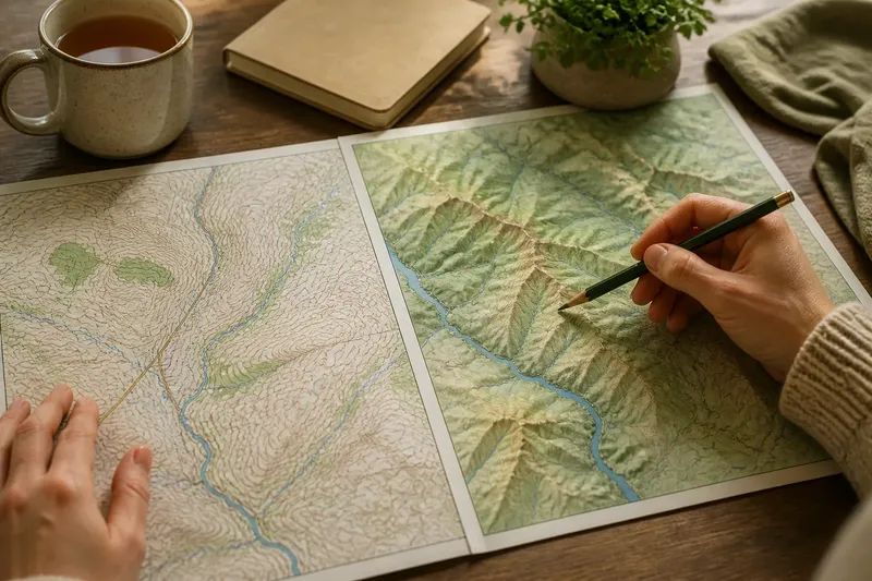
You unfold a county map beside a mug of tea and find that the broad valley looks obvious on one version, while the steep climb to its rim stands out on another. Contour lines or shaded relief offer different clues about the same ground: one marks elevation at intervals, the other suggests the shape of slopes through light and shadow.
Choosing between them is less about which map is better than what you need to notice. A county landscape may include open moor, river valleys, low ridges and built-up ground; no single visual treatment makes every feature equally legible. A short routine over a week can help you settle on a useful view without losing the detail each method provides.
Start with the question
Before choosing a map, name the landscape question in plain terms. Are you trying to see where a valley narrows, compare the steepness of two routes, identify a ridge, or understand how a town sits in its surroundings? The answer points towards the map style that will make the relevant evidence easiest to read.
Contour lines are lines joining places of equal elevation. Their spacing is the central clue: close lines indicate a sharper change in height, while wider spacing suggests gentler ground. A labelled contour gives an elevation value, so the map can support a more precise reading of slopes and height differences.
Shaded relief uses tonal changes to make raised and hollow ground appear three-dimensional. Ridges, spurs and valley sides may become apparent at a glance, especially when contour labels would otherwise compete with roads, streams or settlement names. Yet a shadow is a visual device, not a mark of actual darkness or an indication of which side faces north.
Write down the feature you hope to recognise before comparing map styles. It keeps attractive shading from standing in for useful evidence.
Monday’s first reading
On the first day, use a contour map to read the county’s broad elevation pattern. Begin with a regional view rather than zooming straight into a village. Notice where the lines bunch into bands, where they relax, and how rivers cross or follow the contours. Those relationships can reveal whether a stream runs along a valley floor, cuts across a slope or drops from higher ground.
Then choose one small area and trace a few contours with your eye. Their loops can enclose a summit or a hollow, but context matters: watercourses, spot heights and contour labels help distinguish what the line shapes alone might leave ambiguous. If the map interval is not clear, check its legend before drawing conclusions about how much height separates adjacent lines.
Contour lines are especially useful when the question involves elevation differences, slope, or the shape of a route across rising ground. They can also look crowded in sharply folded terrain, where many lines converge in a compact area.
Wednesday’s shaded view
Midweek, open shaded relief over the same area and at a similar scale. Look first at the large forms: a ridge running through the county, a basin, a broad valley or a succession of upland shoulders. The continuous shading can help the eye follow landforms across administrative edges and across places where roads or labels interrupt a contour map.
Next, check whether the apparent relief agrees with what you already read from contours. A shaded hollow should correspond to a valley or lower area; a prominent ridge should have higher ground along its spine. If the forms seem reversed, inspect the map’s lighting convention and the surrounding features rather than treating the shadow as a measurement.
Say you are comparing two possible paths from a village to a nearby upland edge. On the contour map, you notice that one route crosses a tight cluster of lines while the other follows more widely spaced ones. On shaded relief, the first route appears to climb a distinct shoulder and the second to approach through a broad valley; together, the views suggest where the effort may lie, though neither map alone describes the path’s surface or condition.
Friday’s side-by-side check
On Friday, compare both styles against the same question and map extent. Keep the scale steady: a county-wide view can make broad ridges clear but conceal small gullies, while a close view can make minor folds seem like major barriers. Read the legend, check the contour interval, and note any hill-shading direction given by the map provider.
Use this sequence when a feature remains unclear:
- For height: read contour labels or spot heights; do not infer an exact elevation from the darkness of shading.
- For steepness: compare contour spacing, then use relief shading to see how the slope fits into the surrounding landform.
- For a valley or ridge: trace watercourses and contour shapes first, then see whether the shaded view makes the form easier to follow.
- For a broad county overview: try shaded relief to reveal the main landforms, then return to contours where local changes matter.
- For a crowded map: choose the display that leaves the feature you need visible; switch layers rather than forcing one view to answer every question.
Where a decision depends on a specific map’s symbols or on access and conditions on the ground, follow the map provider’s guidance and relevant local rules.
Which map suits your question?
Which map shows steepness more clearly?
Contour spacing is the more direct clue because it shows how quickly elevation changes across the ground. Shaded relief can make the slope easier to picture, but its tone does not quantify steepness.
Can shaded relief show exact heights?
Not by itself: shading communicates form rather than a stated elevation. Use labelled contours or spot heights when you need height values.
Why do shaded slopes sometimes look reversed?
The effect can occur when the apparent light source conflicts with familiar expectations about how light falls on a landscape. Check the map’s lighting convention and use contours or watercourses to confirm which ground is higher.
Should I choose just one map style?
For a quick overview, one may be enough, but a second view can clarify a feature that is hard to read. Use contours for elevation detail and shaded relief for the larger shape, rather than expecting either to do both equally well.
Sunday’s map choice
At the end of the week, return to your original question and choose a default view for that task. If you need to compare height or read a slope carefully, keep contours in front. If you want to recognise the sweep of ridges and valleys across the county, start with shaded relief. If the landscape has both broad uplands and intricate folds, keep the two views available and move between them deliberately.
Contour lines or shaded relief are not rival descriptions of a county so much as different ways of making its shape visible. Keep the map scale and legend in view, and let the question decide which one gets your attention first.